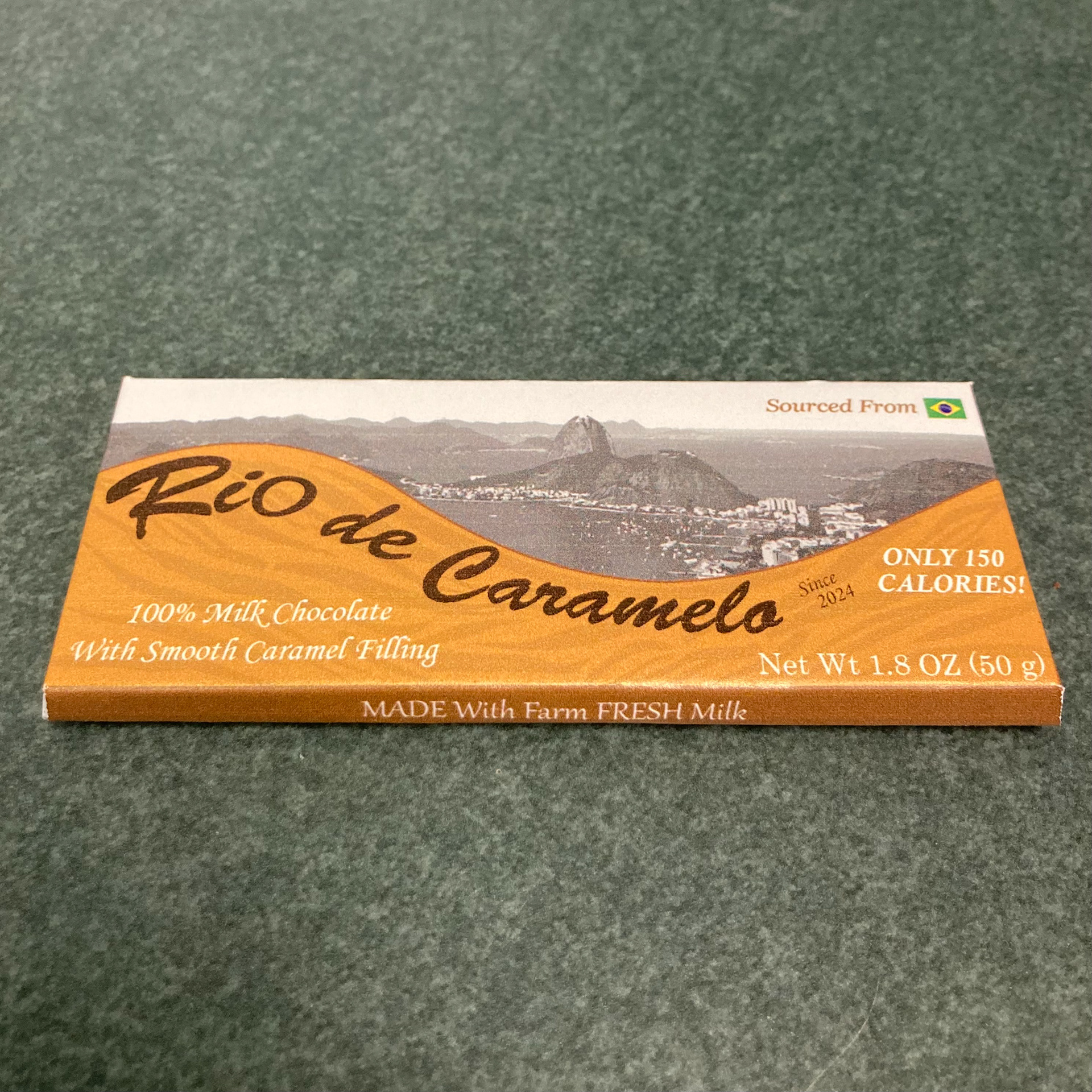
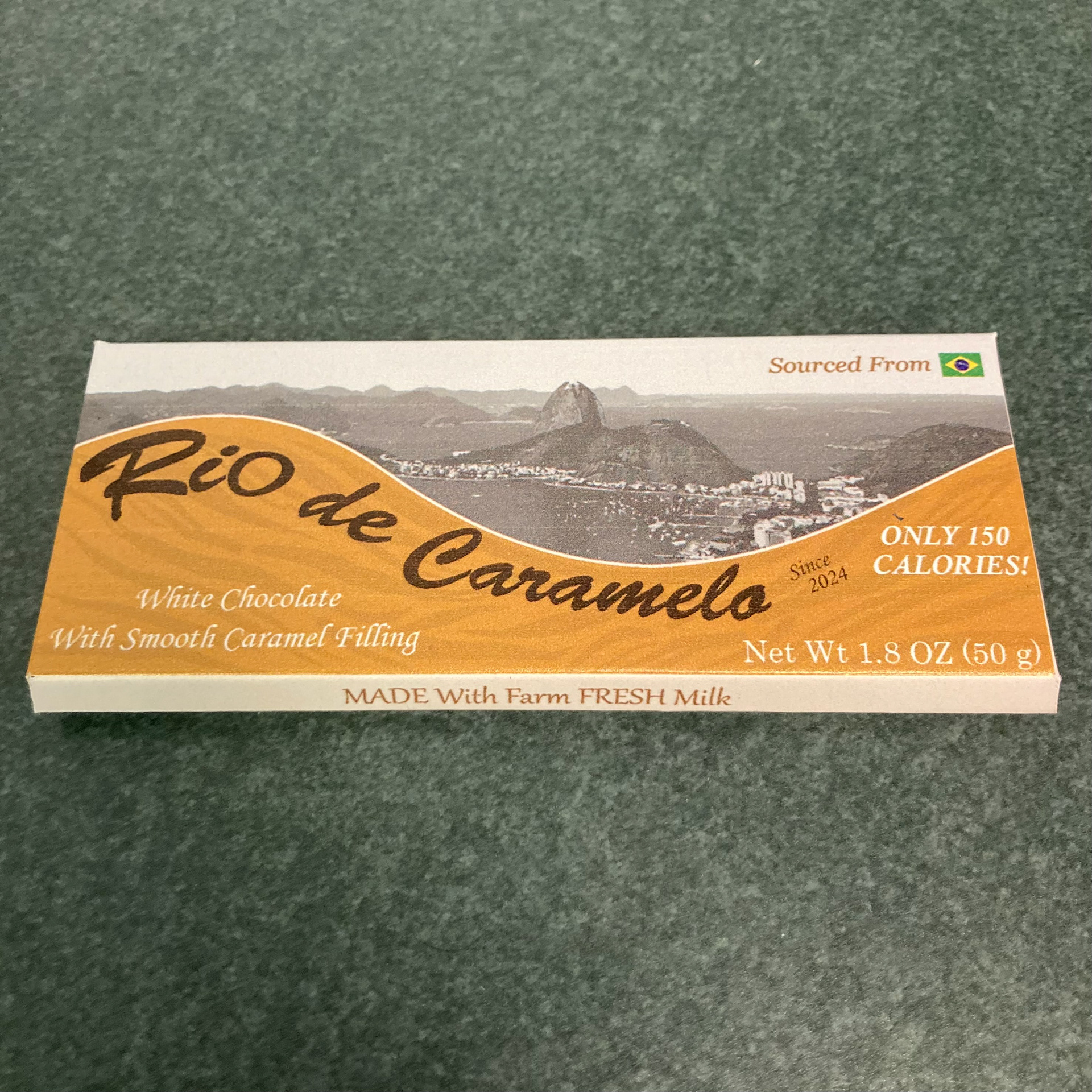
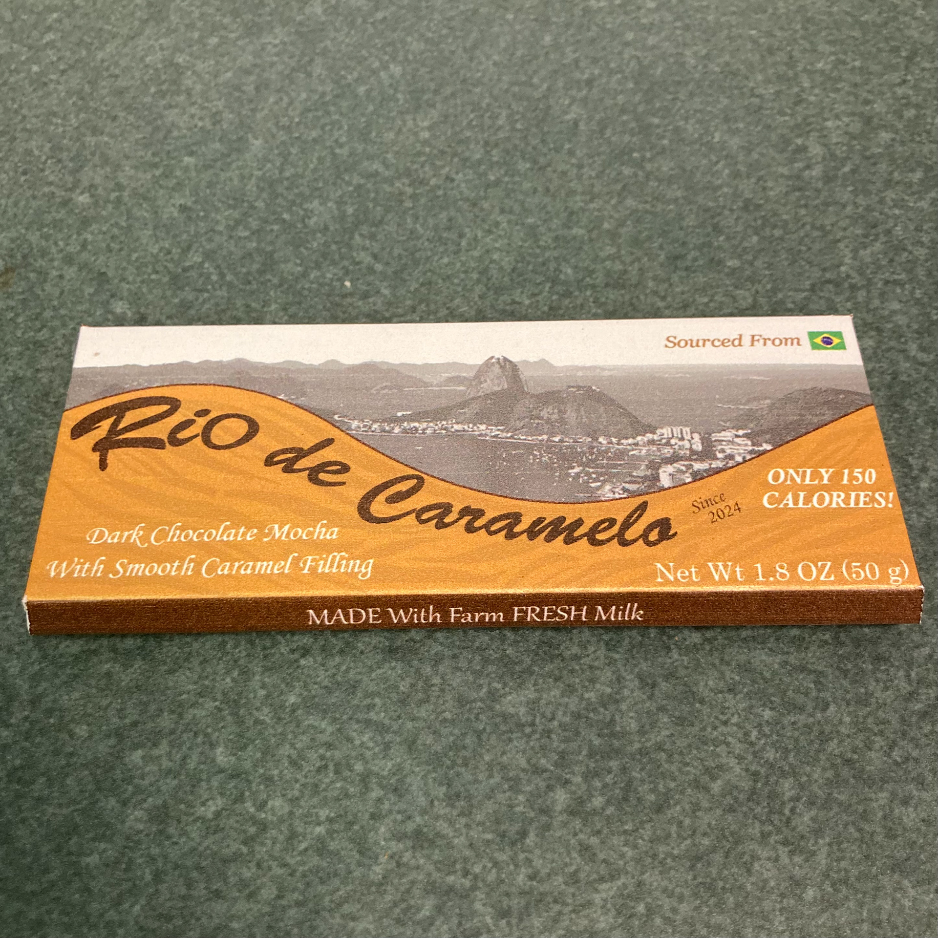
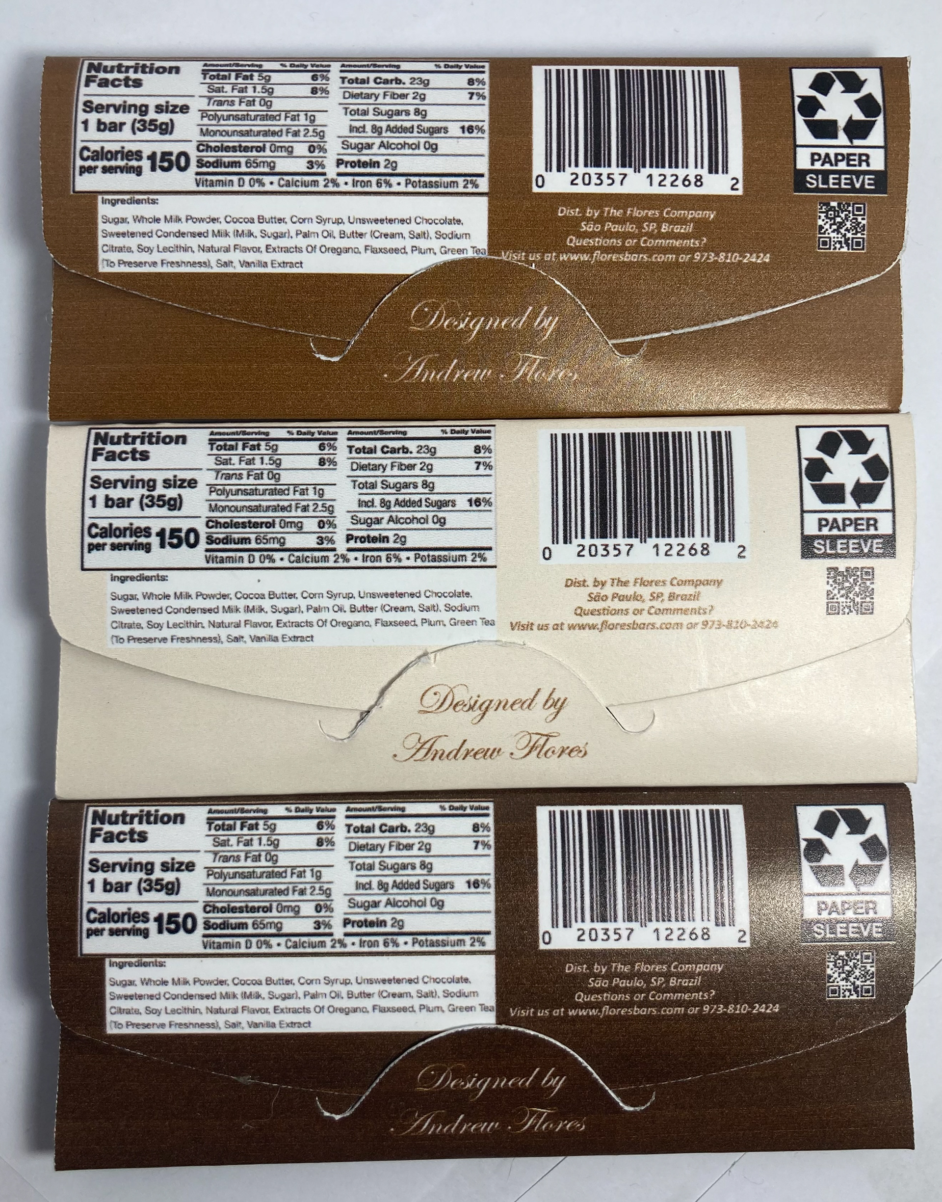

I was tasked with conceptualizing and executing the structural and graphic design for a chocolate bar's primary packaging. The structural design imitates a gum-style package with a tuck flap in the back. For the graphic design, To highlight the smooth caramel in the center of each chocolate square, the Portuguese translation for "Caramel River" was chosen. Hence, the name "Rio de Caramelo" was born. Portuguese is the native language of Brasil, where this bar's chocolate is sourced from. The landscape that surrounds Rio de Janeiro's port was chosen as the background to contrast the bright caramel color. This is meant to give a sense of brand identity and tie the source of the chocolate back to the product as a whole. Three color schemes correspond to the flavor variations of milk chocolate, white chocolate, and dark chocolate mocha.